
Perspectives and Projections
On perspective in photography, sculpture, and anamorphic images.

The Renaissance invention of perspective is only one way to depict things. After a brief detour to photography I'll discuss more spectacular uses of perspective in anamorphic images and artwork based on shadows.
On a first reflection, the techniques of perspective would seem to apply exclusively to drawing and painting, only indirectly and automatically to photography, and not at all to sculpture.
Erwin Panofsky, in an essay about the development of systems of measuring human proportions, describes how the ancient Egyptian sculptures were built from fixed proportions and carved out from three orthogonal outlines: frontal view, profile view, and from above. It would have been possible to send three sketches of the sculpture, specify its size, and let local craftsmen carry out the realisation. The dynamism, expression, the curved shapes of classical Greek art was incompatible with the Egyptian system of fixed proportions and orthogonal projection. Panofsky also mentions the interesting device of perspective correction of sculptures placed above eye level.
... a potential beholder likewise sees the finished work in a foreshortening which, if considerable (e.g., with sculptures placed above eye level), must be compensated for by a deliberate departure from the objectively correct proportions. (Panofsky, p. 84)
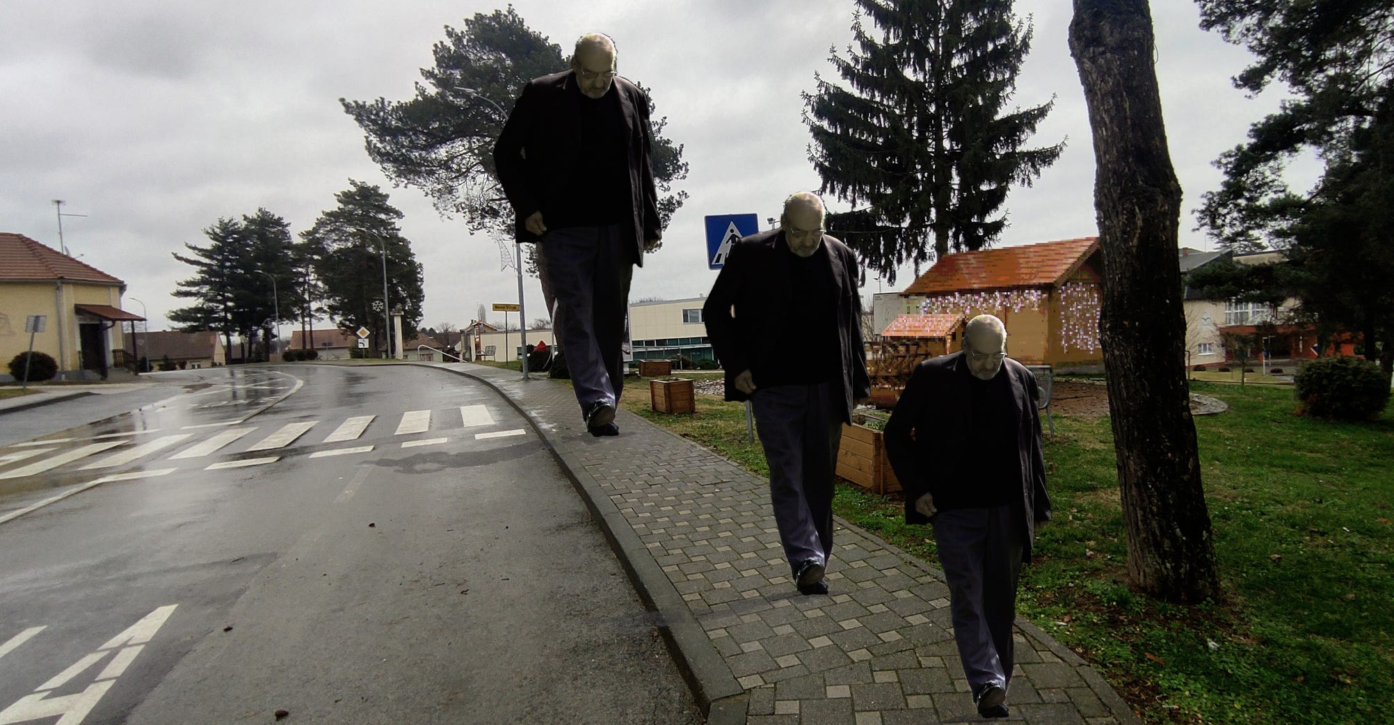
Much later, Giacometti testified of his struggle to capture the impression of figures seen at distance, how they ended up so slender after long endeavours to bring his vision into shape.
Perspective drawing presents us with some ambiguities and challenges that usually go unnoticed. The first assumption is that of a stationary viewer looking with just one eye. As Gombrich puts it, we cannot see around corners, and this is a constitutive fact of perspective – but with two eyes we can! In any scene with sufficient depth, with objects very close to the viewer and a more distant background, the nearby objects will occlude the background at different points depending on which eye we look with. To capture panorama views, we have to turn our head to focus on the details on the left and right, which also conflicts with the principle of a single viewing position and viewing angle.
J. J. Gibson, the founder of ecological psychology, came to realise what now sounds obvious, that we perceive the world around us while moving around in it. Applied to perspective, however, it is a less obvious premise which might be used to argue against the presumed inevitable correctness of central perspective. Gibson stressed that we perceive invariants, not shapes and colours as we see them from one singular point, because from other points their shape as projected on a flat surface would look different.
Rudolf Arnheim drew upon Gestalt theory, which explains perception from the principle of simplest organisation of sensory data. A trapezoid shape in a picture is less simple than a rectangle or a square, which means that we are likely to see it as, for instance, a square block on the floor deformed by perspective, rather than a trapezoid shape standing upright. However, as Gombrich points out, there is nothing, except our previous experience, that forbids the interpretation of a shape in a picture to be at any distance and in any orientation, although the use of texture, shading, and shadows tends to disambiguate the image.
There was an engaged debate between Gombrich, Gibson, and Arnheim concerning visual perception, touching on questions such as what makes us able to distinguish a picture from the scene it depicts. Gombrich argues that we must at least partially refer to learned knowledge when we infer the size and distance of a familiar object in an image, because, if we don't know what size the object is, it might be very small and close or enormous but far away while occupying the same picture area.
Photography and its imitators
Today smart-phone photos is the typical medium that translates into painting, prints, and drawings. Everyone is forced to have a smart-phone, not by enforceable law, but by the even stronger imperative of convenience. Those who have one and always bring it around (which seems to be the point) may be inclined to take photos of scenes which, in earlier times, you would have to bring a real camera to document, and before that, pen and paper, or an easel, paint and canvas, and then have some patience to sit there and draw the motive. Plein air painting, as practised since impressionism, apparently began as a result of the invention of the paint tube which allowed artists to bring their paints with them. This period roughly coincides with the invention of the camera, with its more well-known transformative influence on painting.
With the various lenses that are available photography can explore depth perspective and flatness, wide-angle views or narrow zooms. Smart-phone users have mostly resorted to the images their built-in camera provides, highly detailed but with limited options to shape the image at the time of capture. Nevertheless, these images are obviously a useful resource for artists; they don't necessarily have to sit down and draw a complicated and potentially shifting scenery in real time. But the haphazardly captured image is full of random elements, the noise of the quotidian, plastic bags or litter strewn on a street, an arm and a leg of a person who is mostly outside of the frame (though such compositional devices can be found also in some of Munch's paintings, incidentally also a photographer on the side). Both the perspective and the unplanned composition hint that an artistically transformed image originates from a smart-phone photo. It doesn't have to end up as photo realism, there are interesting examples such as Kira Wager's paintings with a rough expressionistic surface boldly shaped by palette knife, which reveal themselves as familiar indoor scenes or portraits when you take a step back. Mattias Härenstam's woodcuts also often bear the mark of originating from photos. In one particularly striking example, as I recall it, we see the long sunset shadow cast on what might be a dandelion field by the person holding up the camera. Although I am not familiar with the details of Härenstam's working process, the woodcuts have a distinctly digital photographic quality, as if they had been transferred from digital images already reduced to black and white, with the equivalent of digital dithering chiselled out in fine incisions.
Despite the variation obtainable through the use of different lenses, camera perspectives share in common the single point focus, in contrast to the way a 2D scanner works. A flat-bed scanner can be used to scan in 3D objects, provided they are small enough, simply by placing them on the surface. In opposition to the single point focus of a camera, the scan line moves across the entire surface which creates an eerie parallel perspective. Not very much depth can be captured though, objects too far removed from the surface simply disappear. Man Ray's flattening of perspective in his experimental rayographs also deserves mention. As a form of camera-less photography its perspective is similar to the flat-bed's parallel projection.
Jan Dibbets's conceptual photos in Perspective Corrections also achieve a distorted perspective, in his case by manipulating the scene. In this series from 1967-69, Dibbets cut out certain shapes in fields in such a way that they look like perfect squares or circles on the picture plane, whereas in reality they were trapezoidal or elliptic shapes.
A consequent use of parallel perspective is rare and hard to achieve in practice. It would require for the artist to move around and gaze straight forward for each spot in the picture plane. Parallel perspective is also a prerequisite for the impossible figures by Oscar Reutersvärd and Escher. In a reversal of Dibbets's method of making oblong or trapezoid shapes appear as circles or squares, it would be possible to build a 3D model of one of Reutersvärd's impossible figures, but the model would only resemble the drawing from one specific viewing point.
The convenience of the camera as a source of models for paintings, instead of sketches or memory images, leads to a certain reduction in aesthetic effects. Bonnard is said to have painted largely from memory, with the consequence that his compositions include a wider panorama than usual and, more easily spotted, perspective inconsistencies between parts of the scene. Even more prominent inconsistencies are found in Neo Rauch's images, where human proportions and the scale of buildings and various objects are often as incommensurate as in a collage. Apart from their stylistic references to socialist realism, these images are prone to becoming compared with the tone-deafness of utterly failed AI-generated art even though Rauch has remained true to his style already for a few decades.
Anamorphosis
In the museum where I grew up they had an anamorphic work, a reflecting cylinder surrounded by an annulus-shaped drawing on the table it stood on. As you approached it, the image of a Dutch-tile stove rose up in the cylinder. Fascinating, yet nothing remarkable compared to Jonty Hurwitz's anamorphic sculptures of hands, horses, or frogs that twist and curve like pole dancers around their cylindrical mirror.
There are in fact two types of anamorphic art. Works that use reflections in curved surfaces, often cylinders and sometimes cones, pyramids, or other shapes are known as catoptric anamorphosis. Then there is perspective anamorphosis, which has been known at least since Leonardo da Vinci. The idea is to distort the perspective so that it looks correct from a certain viewing angle other than the typical viewpoint right in front of the picture.
Although the geometry of anamorphic images is straightforward, actually assembling them can be tricky. An interesting resource (in Spanish) explains how to make your own anamorphic images, and also points out that anamorphic perspective was apparently practised already by Lascaux cave painters in order to make their images look right on the bulging surface. And if you intend to try it yourself, the most practical advice is probably to use a projector, keep it absolutely steadfast, and plan ahead for long working hours.
Holbein's drawn out caput mortuum in The Ambassadors remains the most famous anamorphic image. It has been studied in detail, with speculations about the ideal location of the viewer and the construction of the image. A witty woodcut by Erhard Schoen from the same period reveals an anamorphic portrait steganographically concealed in a landscape.
More recently some artists have begun to experiment with anamorphic images in new ways. Michael Murphy is known for his anamorphic installations building up an image from clouds of tiny particles such as ping-pong balls seemingly randomly scattered in the air, except from one particular point where they coalesce into an image.
Many of his works project two different images depending on the viewer's position. For example, in Make America Great, bank notes form the shape of America from a frontal view, and spell out "GREAT" from the side. It is perhaps no coincidence that Murphy's work serves as advertisements for various products or promotion for artists in the music industry as often as it delivers a rather straightforward political message; their spectacular, showy character serve the commercial powers just as well as they may express a mild concern for the status quo.
Since anamorphic art so easily passes for entertainment, it is no great surprise to find it presented in a Canadian programme series aptly titled "capsule divertissements." The show host notes in awe "quel travaille il faut mettre dedans" while admiring the technical proficiency of the artists. As they also point out, these images have circulated widely on social media. It is an easily shareable form of art exquisitely adapted to the internet. Perspective anamorphosis may be more delicate in real life than in the re-flattened photo documentation. The eye's depth focus disturbs the perception, and the image must be seen from one specific position. Adding to their allure, in photos it may even be hard to distinguish real people and objects around the rather realistic images of anamorphic street art such as those of Julian Beever.
There are indeed many examples of realistic anamorphic images, which prompts the question, are there no abstract anamorphic images? Of course there are, Felice Varini has constructed such images since the late 1970's, often from simple shapes such as concentric circles and spirals. Anamorphic projections of text are also common. The technique demands that the figure be recognisable as something, otherwise there would be no correct point of view inducing that sense of surprise when one finds it.
The geometry of cast shadows resembles that of anamorphic images. Some artists, like Kumi Yamashita, have constructed delicate works just with light and carefully positioned and shaped objects casting shadows. Only when light falls from a specific angle does the shaped object on the wall cast the shadow of some familiar object. In one case, a stainless steel object shaped as an exclamation mark casts the shadow of a question mark; there are also some profile portraits made of the shadows of scattered single digits on the wall.
Marcel Duchamp's last work, Étant donnés..., which he worked on for the last 20 years of his life, consists of a door with two peeping holes and an elaborate installation on the inside. According to Serkan Özkaya's speculative theory the scenery inside, the naked woman lying on the ground with legs spread, holding a burning oil lamp, is not the main point, instead the installation supposedly is a kind of camera obscura in reverse, projecting some image outwards through the peeping holes. Maybe, with lots of uncritical wishful imagination, one can discern the eyes of Rrose Sélavy in the diffuse projection which emanates from Özkaya's reconstructed scale model of the installation. Because, as Léon Mychkine believes, why would Duchamp spend twenty years on this otherwise slightly silly project unless it was a remarkably clever piece of engineering?
References
Chamberlain, R. & Pepperell, R. Slow Looking at Slow Art: The Work of Pierre Bonnard. Leonardo, 2021.
Arnheim, R. Art and Visual Perception. A Psychology of the Creative Eye. University of California Press, 1974.
Gombrich E. H. Art and Illusion. A study in the psychology of pictorial representation. Phaidon, 2002.
Panofsky, E. Meaning in the Visual Arts. Penguin Books, 1993 (first published 1955).
Gombrich, Gibson, and Arnheim's debate can be found in Leonardo, Vol. 4, 1971.
Support
My writings will remain freely accessible, not hidden behind a paywall. If you nevertheless would like to support my work, the best way to do so is to buy one of my albums or even a print.